Introduction
We are living in a digitalized world where businesses produce massive amounts of data every single day. Raw data is important but in itself doesn’t determine business success; analysis, interpretation, and appropriate visualization are key to inform decisions. This BI solution also provides data visualization, which plays a crucial role in converting complex sets of data into informative representations that help organizations enhance their operations via identifying trends and optimization of the decision-making process.

What is the Role of Data Visualization in Business Intelligence?
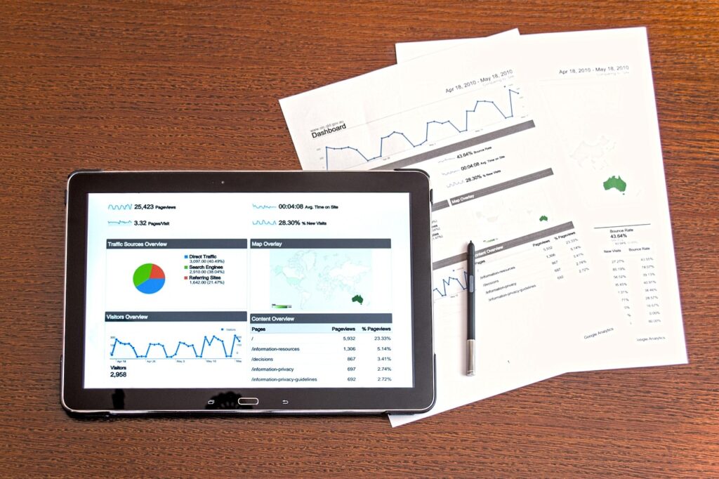
Business Intelligence (BI) May be quantified because the charting Of business data through the graphs, Map, And dashboard. By providing condensed versions of extensive datasets, it streamlines the analysis process for businesses and aids in the derivation of actionable insights.
Importance of Data Visualization in BI
- Improved Decision-Making: Visualizations allow decision-makers to understand trends and patterns in data more quickly than reading through raw spreadsheets or reports.
- Detecting Market Trends: Businesses analyze customer behavior, demand changes, and industry trends using interactive dashboards.
- Data-Driven Strategy: Organizations can adapt marketing strategies, financing axes, and operational effectiveness according to instant feedback.
- Quicker Reporting: By automating data visualization, the time taken to create business reports is minimized.
- Improved Risk Management: Good visualization helps to spot anomalies, outliers, and potential risks before it’s too late.
Real-World Use Cases
- Sales Performance Analysis: BI tools help visualize sales data, enabling companies to monitor revenue growth, customer acquisition rates, and regional sales trends.
- Marketing Campaign Analytics: Data visualization is used by marketers to report the success of digital campaigns, evaluate audience demographics, and plan ad spend.
- Financial data representation: Financial analysts use visual dashboards to monitor cash flow, profit margins, and expense trends.
- Customer Experience and Feedback Analysis: Customer feedback and reviews can be converted to sentiment analytics dashboards that can be used to improve/maintain customer experience.
- Supply Chain and Logistics Optimization: Data visualization helps businesses monitor inventory, manage logistics, and minimize disruptions to the supply chain.
Which is Best for Data Visualization and Business Intelligence?
Selecting proper data visualization tools varies based on business needs, the complexity of business data, and integration capabilities. We list the top BI and data visualization tools:

1. Tableau
- Also known as interactive dashboards, ‘BI’ tools.
- Well connected with different data sources.
- A drag-and-drop interface for easy navigation
2. Microsoft Power BI
- Best for companies that rely on Microsoft products.
- Provides live data mapping and government-business analytics.
- Cloud and enterprise-scale capable
3. Google Data Studio
- Free tool that integrates perfectly with Google Analytics and Google Ads.
- Best for marketing and digital analytics.
4. D3.js
- Custom Data Visualization: Open Source JavaScript Library
- Ideal for developers that need advanced visualization techniques.
5. Qlik Sense:
- Intuitive Interface for AI-Driven Analytics
- Good for self-service data exploration.
6. Looker
- A Google BI platform with powerful business analytics capabilities.
- Cloud-native with strong data modeling capabilities.
Can AI do data visualization?
Artificial intelligence (AI) is revolutionizing data visualization in BI with automation of insights, anomaly detection, predictive insights, etc. Here’s how AI does this in data visualization:
- Automated Insights: AI algorithms can analyze datasets and report critical findings, all without the need for human intervention.
- Predictive Analytics: AI-enabled BI tools predict future trends from past data.
- Natural Language Processing (NLP): Users can ask questions in simple language and receive visualizations right away.
- Anomaly Detection: The AI detects unusual patterns that may indicate a fraud or other business breakdown.
- Smart Data Recommendations: Receiving real-time assistance in determining the most effective chart types and suitable formats for data representation.
Some of the most popular data visualization tools that leverage AI include Tableau AI, Microsoft Power BI AI Insights, and Google Looker AI.
What is visual analytics in business intelligence?
Visual analytics is an advanced BI implementation of data visualization in which AI and machine learning combined with interactive dashboards provide customers or decision-makers with deeper insights.
Key Features of Visual Analytics:
- Real-time Data Processing: Drill down and explore data from various viewpoints
- Interactive Dashboards: Drill down and explore data from various viewpoints
- Data storytelling: Data storytelling uses visual elements to convey data insights.
- Predictive modeling assists businesses in predicting future outcomes.
Industries such as finance, healthcare, and e-commerce rely on visual analytics for advanced decision-making.
Conclusion
However, data visualization for business intelligence is a game-changer. With interactive dashboards, AI-powered analytics, or even advanced visual analytics in BI, businesses can get ahead of the competition using meaningful insights at speed.
BI tools such as Tableau, Power BI, Google Data Studio, and Looker empower businesses to generate dynamic reports and dashboards that fuel success. This entire process can be augmented by AI by further automating insights, analyzing trends, tracking the opportunities, and predicting future outcomes.
Organizations should work to implement advanced data visualization strategies, dashboards in BI, and AI-driven analytics to stay competitive.
With the right tools and techniques in place, however, raw data can be refined into business intelligence, providing the onramp to growth and success.
